
Brand Identity Case Study


Overview
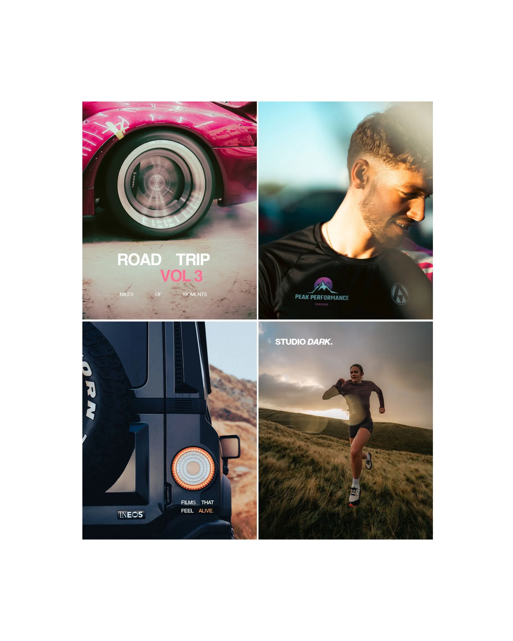
Studio Dark is a photography and film production company focused on creating cinematic, story-driven content for brands, businesses, and individuals. The challenge was to develop a visual identity that reflected the studio's bold creative approach while maintaining the flexibility required across photography, film, social media, print, and digital touchpoints.
The resulting identity embraces contrast, confidence, and atmosphere - capturing the same visual intensity found within Studio Dark's work.
The Challenge
Many creative production companies rely on industry clichés: camera icons, film reels, apertures, and overly technical visual language.
Studio Dark needed a brand that felt contemporary and creative without leaning on predictable photography tropes. The identity needed to communicate professionalism while reflecting the cinematic nature of the studio's work.
The goal was to create a system that could sit comfortably alongside high-end commercial photography, automotive content, brand campaigns, and documentary-style filmmaking.
Brand Strategy
The concept centred around a simple idea:
Bold Creative Visuals.
Rather than positioning the studio around equipment or technical capability, the brand focuses on the outcome - powerful visual storytelling.
The name "Studio Dark" naturally evokes contrast, shadow, atmosphere, and the photographic darkroom. These ideas informed every element of the identity, from typography and colour to imagery and application.
The brand was designed to feel:
Cinematic
Confident
Contemporary
Creative
Memorable
Applications
The identity was designed as a flexible system rather than a single logo.
The business card design uses dramatic contrast and bold typography to create a memorable first impression. Key information is organised clearly while maintaining the visual confidence established throughout the brand.
Large-scale messaging and colour-led compositions allow the brand to stand out in fast-moving digital environments. The system is easily adaptable for promotional content, portfolio showcases, and campaign assets.
The logo and supporting brand elements integrate naturally with photography and video content without competing with the work itself. This ensures consistency across reels, films, thumbnails, presentations, and client deliverables.
Outcome
The final identity positions Studio Dark as a modern creative production company that values storytelling, atmosphere, and visual impact.
By avoiding common industry clichés and focusing on bold typography, cinematic contrast, and a distinctive colour palette, the brand creates a strong visual presence that reflects the quality and character of the studio's work.
The result is a scalable identity system that feels equally at home across print, digital, photography, and film - allowing Studio Dark to present itself with the same confidence and creativity found in its visual output.
Services
Brand Strategy
Visual Identity Design
Art Direction
Typography System
Colour Development
Print Design
Digital Brand Assets